|
Bill Blair's Crab Nebula Photo File |
|
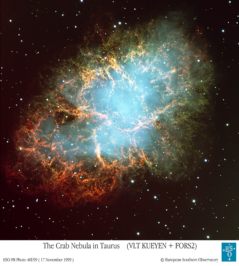
Photo credit (left): FORS Team, 8.2-meter VLT, ESO
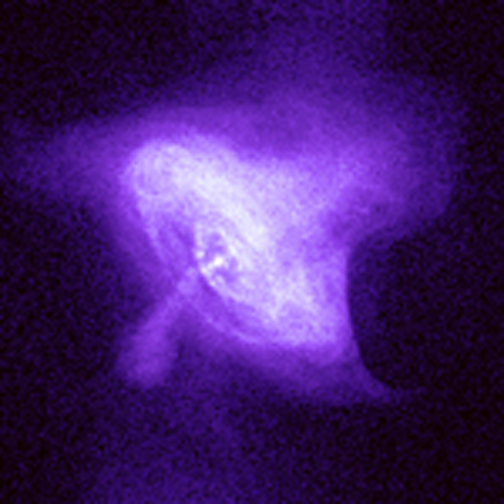
Photo credit (right): Chandra X-ray Observatory, NASA
|
|
Bill Blair's Crab Nebula Photo File |
|
Photo credit (left): FORS Team, 8.2-meter VLT, ESO
Photo credit (right): Chandra X-ray Observatory, NASA
![]()
Welcome! This site describes some spectacular images of the Crab Nebula (also known as Messier 1 or NGC 1952), a roughly 950 year old remnant of a supernova explosion in our Milky Way galaxy. This object is about 6500 light years away in the constellation of Taurus, and is actually visible with a modest amateur telescope (if you know where to look!). However, the images shown here reveal the Crab Nebula in ways that ground based telescopes cannot hope to match.
The images shown below were obtained with the Hubble Space Telescope and the Wide Field Planetary Camera 2 as part of a research project in 1996. The data have just been reprocessed and released by the Hubble Heritage Project in June 2000 as part of their ongoing goal of bringing the best of Hubble to the general public.
On this site, I attempt to bring you closer to the action by describing the images and what they show in more detail, and by showing different color schemes from that used in the Heritage release. In general, I use only three images (three colors) at a time, one each shown in red, green, and blue. These three colors add together in various combinations to produce the full range of colors you see. For instance, where green and red are both bright, one sees yellow, or where red and blue combine, the filaments take on a "pinkish" tinge, and where blue and green combine we see aqua. Where all three images are bright, one sees white. For comparison, the Heritage image combined five different images into one. Taken together, you can hopefully see that looking at the same data in different ways often reveals different information!
Below I show small images and brief captions. Click on any of these images to see a bigger version of each figure. Enjoy!
-- Bill Blair
![]()
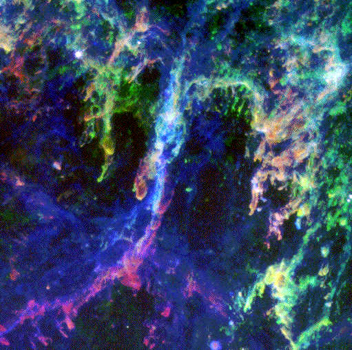
 Region 1: Southeast Central Crab Nebula region.
Often when you see a color picture in astronomy, be it from Hubble
or from a ground-based telescope, what you are really seeing is several different
pictures taken in different colors or kinds of light, that have been aligned and
combined into one. That's the case here. In this picture, I have combined the three
images below (shown in black and white), displaying each as a different primary
color--blue, green, or red. Where a region is bright in more than one image,
the colors combine to create more colors and shades. For this picture, you can think of
the colors as representing BLUE = hot, low density gas; RED = the densest, coolest gas,
and GREEN = warm, intermediate density gas. (Details below.) The "turquoise" color arises
where green and blue are bright together.
Region 1: Southeast Central Crab Nebula region.
Often when you see a color picture in astronomy, be it from Hubble
or from a ground-based telescope, what you are really seeing is several different
pictures taken in different colors or kinds of light, that have been aligned and
combined into one. That's the case here. In this picture, I have combined the three
images below (shown in black and white), displaying each as a different primary
color--blue, green, or red. Where a region is bright in more than one image,
the colors combine to create more colors and shades. For this picture, you can think of
the colors as representing BLUE = hot, low density gas; RED = the densest, coolest gas,
and GREEN = warm, intermediate density gas. (Details below.) The "turquoise" color arises
where green and blue are bright together.
See how the faint blue gas seems to envelop the the other colors? That tells
us that the hotter, lower density gas surrounds the denser, clumpier gas seen in the other
colors! Cool! (Well, hot actually! Even the "cool" gas in this image is about 10,000
degrees Fahrenheit!)


These three black and white images show the three separate images that were combined into the color image above. From left to right are shown images in the light of
While at first you may think these three black and white images look similar, combining them into the color image above REALLY shows their similarities and differences!
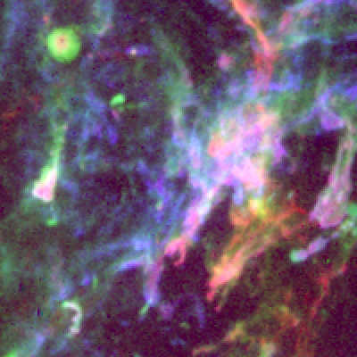
 Region 2: Southwest Central Crab Nebula region.
This region shows the brightest optical filaments in the Crab Nebula! If it looks like
a "train wreck" to you, that's because at this location we are looking right through the
middle of the nebula, and hence see material in projection as it is coming towards us and
going away from us at high velocities. The Crab pulsar, the collapsed core of the star
that exploded, would be at the upper left in this picture near the aqua colored clump
of filaments. Everything you see in this picture is the ejecta -- the "star stuff"
from the outer layers of the star that exploded -- that are being flung back out into space.
The bright filaments cutting across the image are actually on the near side of the nebula
and coming toward us at 800 kilometers per second! (That's right, boys and girls,
ladies and gentlemen! That's like 500 miles per second or almost 2 million miles per hour!)
The filters and colors are nearly the same as the picture above. The only difference is that
the GREEN filter here is HST/WFPC2 filter F658N, centered on [N II] 6583 Angstroms (instead of
H-alpha).
Region 2: Southwest Central Crab Nebula region.
This region shows the brightest optical filaments in the Crab Nebula! If it looks like
a "train wreck" to you, that's because at this location we are looking right through the
middle of the nebula, and hence see material in projection as it is coming towards us and
going away from us at high velocities. The Crab pulsar, the collapsed core of the star
that exploded, would be at the upper left in this picture near the aqua colored clump
of filaments. Everything you see in this picture is the ejecta -- the "star stuff"
from the outer layers of the star that exploded -- that are being flung back out into space.
The bright filaments cutting across the image are actually on the near side of the nebula
and coming toward us at 800 kilometers per second! (That's right, boys and girls,
ladies and gentlemen! That's like 500 miles per second or almost 2 million miles per hour!)
The filters and colors are nearly the same as the picture above. The only difference is that
the GREEN filter here is HST/WFPC2 filter F658N, centered on [N II] 6583 Angstroms (instead of
H-alpha).
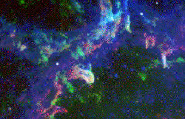
 Region 3: Northern Central Crab Nebula region.
This grouping of filaments is playfully referred to as "the hook." The color/filter combinations
are the same as shown in the region 1 image above. This image shows an interesting effect that
is present (but less obvious) in the other images. There is no "green" emission in the lower left
corner of this image! This is not a "real" effect. It is due to the fact that the filaments
in this region are moving away from us so rapidly that, in the green filter they Doppler-shift
right out of the filter's narrow bandpass! This is a problem for astronomers (like myself)
who want to understand what the changing colors indicate about the gas being observed! Luckily,
by comparing to ground based data, we can usually figure out what's going on when we see things
like this. Here again, you can see how the blue gas surrounds the other colors, as noted in the
Region 1 caption.
Region 3: Northern Central Crab Nebula region.
This grouping of filaments is playfully referred to as "the hook." The color/filter combinations
are the same as shown in the region 1 image above. This image shows an interesting effect that
is present (but less obvious) in the other images. There is no "green" emission in the lower left
corner of this image! This is not a "real" effect. It is due to the fact that the filaments
in this region are moving away from us so rapidly that, in the green filter they Doppler-shift
right out of the filter's narrow bandpass! This is a problem for astronomers (like myself)
who want to understand what the changing colors indicate about the gas being observed! Luckily,
by comparing to ground based data, we can usually figure out what's going on when we see things
like this. Here again, you can see how the blue gas surrounds the other colors, as noted in the
Region 1 caption.

Although this is a complicated region of filaments, you can see a number of "fingers" of material that point more or less toward the lower left in this picture. These fingers are dense filaments of gas and are pointing back roughly toward the central pulsar. We believe these fingers are dense regions of gas held in position by strong magnetic fields which are trying to hold out against the expanding bubble of hot gas created by the pulsar.
The circular feature at upper left is unique in the regions we have observed. The red core surrounded by blue (left) or green (right) indicates clearly a cool, dense region surrounded by hotter, lower density gas. Could this be one of the "fingers" of gas on the back side of the nebula, pointing directly at us? Or is it really a spherical dense knot of gas whose outer layers are baking off as it is engulfed by the hot gas from the pulsar? We think the latter is closer to the truth, but it is hard to know for sure.
 Region 5: Southeast Central Crab Nebula region, enlarged.
This small region is just above Region 1 and uses the same colors/filters described there.
Here again we see the effect of the faint blue glow enveloping the denser, clumpier filaments
seen in the other colors. The central bright "thumb" of gas pointing to the right is one of the
"fingers" (as seen in Region 4) on the back side of the nebula pointing almost directly toward us.
Region 5: Southeast Central Crab Nebula region, enlarged.
This small region is just above Region 1 and uses the same colors/filters described there.
Here again we see the effect of the faint blue glow enveloping the denser, clumpier filaments
seen in the other colors. The central bright "thumb" of gas pointing to the right is one of the
"fingers" (as seen in Region 4) on the back side of the nebula pointing almost directly toward us.
![]()
